When you have a fixed-width element, but the text inside it has dynamic length, it is a good idea to make sure it does not overflow or create unnecessary line breaks. One way to do that is to scale the font size to scale down the text and make it fit, if it’s too long.
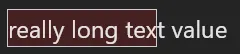
For example, if this happens:
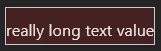
We want it to look like this:
Unfortunately, CSS alone is not capable of that (yet!). Therefore, you need to involve JavaScript, for example by using a library designed specifically for this purpose. This article could end right here, but there’s no fun in that—so let’s take a look how we can implement this by ourselves.
We will create a Vue 3 component called ScaledValue. I’m going to use a single-file component and composition API for this, but it will work with other component types as well.
Let’s set up the template first. We will create two elements:
- Value element, which contains the text that needs to be scaled. For this component, that text will be passed by the parent component using a slot.
- Container element, which wraps the value element.
Since we will be working with these, and setting styles for them, we can also add the ref Vue directive and style binding.
<script>
  import { ref } from "vue";

  const containerElement = ref();
  const valueElement = ref();

  const valueStyle = {};
</script>

<template>
  <div ref="containerElement" style="display: block; width: 100%;">
    <div ref="valueElement" :style="valueStyle">
      <slot></slot>
    </div>
  </div>
</template>
We know that we will be changing the font size for the value element, to make it fit into the container element. Let’s define a scale ref that will affect the font size. Its value will be set as font-size CSS property on the value element, using em units. This will make it relative to the font size of the parent element (for example, the <body> element).
const scale = ref(1);

const valueStyle = computed(() => ({
  display: "inline-block",
  fontSize: `${scale.value}em`,
  whiteSpace: "nowrap",
}));
Now, let’s calculate the ratio, which represents how much we need to shrink the value element. We achieve this by dividing the width of the value element by the width of the container element.
const containerWidth = containerElement.value.offsetWidth;
const valueWidth = valueElement.value.offsetWidth;

const ratio = valueWidth / containerWidth;
For example, if the value element is 320 pixels wide, and the container element is 200 pixels, we need to shrink the value element by 200 / 320 = 0.625 = 62.5%. As we want to shrink it by changing the font size, we would set font-size: 0.625em on the value element.
A possible next step is to set scale.value = ratio every time the size of the value element changes. However, this has two problems.
The first one is that the value element might already be shrunk from before. Continuing the example from above, let’s say the value element now has font-size: 0.625em and fits neatly into the 200 pixel container. Now we change the text in the value element to be longer, and the width grows again, this time to 250 pixels. To make it fit again, we need to shrink it by 200 / 250 = 0.8. If we set font-size: 0.8rem, the element will actually get bigger, since previously it had font-size of just 0.625em. The correct font-size is the previous value, multiplied by ratio: 0.625em * 0.8 = 0.5em.
Therefore, the correct way to change the value of scale is to multiply the current value by ratio: scale.value = scale.value * ratio. This will then cause the current font-size to change by the correct amount, as described in the previous paragraph.
The second problem is that we can cause an infinite loop. At first, the value element is too large to fit into the container element, so we shrink it. But if it’s now too small, we make it bigger. This causes it to be too big again, so we shrink it. And so on…
This can be solved by having some “buffer”, where we leave the value element a bit smaller than it could be. Let’s change the value of scale only if ratio is less than 0.9, or more than 1. Optionally, we can also make sure the font size will not be bigger than 1em.
if (ratio > 1) {
  scale.value = scale.value / ratio;
} else if (ratio < 0.9) {
  scale.value = Math.min(scale.value / ratio, 1);
}
Finally, we can wrap all this code for updating scale in a function, and call it every time the size of the value element changes. For that, we will get help from the useResizeObserver hook, which does exactly what we need—calls a function when the size of an element changes.
function recalculateRatio() {
  if (containerElement.value === undefined || valueElement.value === undefined)
    return;

  const containerWidth = containerElement.value.offsetWidth;
  const valueWidth = valueElement.value.offsetWidth;

  const ratio = valueWidth / containerWidth;

  if (ratio > 1) {
    scale.value = scale.value / ratio;
  } else if (ratio < 0.9) {
    scale.value = Math.min(scale.value / ratio, 1);
  }
}

useResizeObserver(valueElement, recalculateRatio);
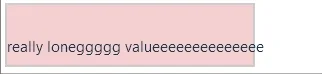
And that’s it! Now the value element will shrink or grow as needed. You can try it out in the demo below—try changing the value in the input and watch the font size change.
The complete code for the ScaledValue component is on CodeSandbox, in the components/ScaledValue.vue file.